UKFast / ANS · 2021–2023 · Head of UX Design
One shared design language
Two brands. More than 100 products. No shared design language.
UKFast / ANS · Head of UX Design
The challenge
When UKFast and ANS merged, two brands came together with more than 100 products. Teams worked on different technology stacks and kept designing and building the same interface pieces from scratch, each one slightly different.
The cost wasn't only inconsistency. Duplicated components meant duplicated effort, decisions were made product by product, and ideas often went into build before anyone had tested them with users.
It was a merger of two cultures, too. UKFast already had a design system and ways of working I'd built there. ANS had neither, and no dedicated UX function. Bringing the teams together meant teaching as much as building.
What I did
As Head of UX Design, I led the UX strategy for the merged business and the design system that tied it together.
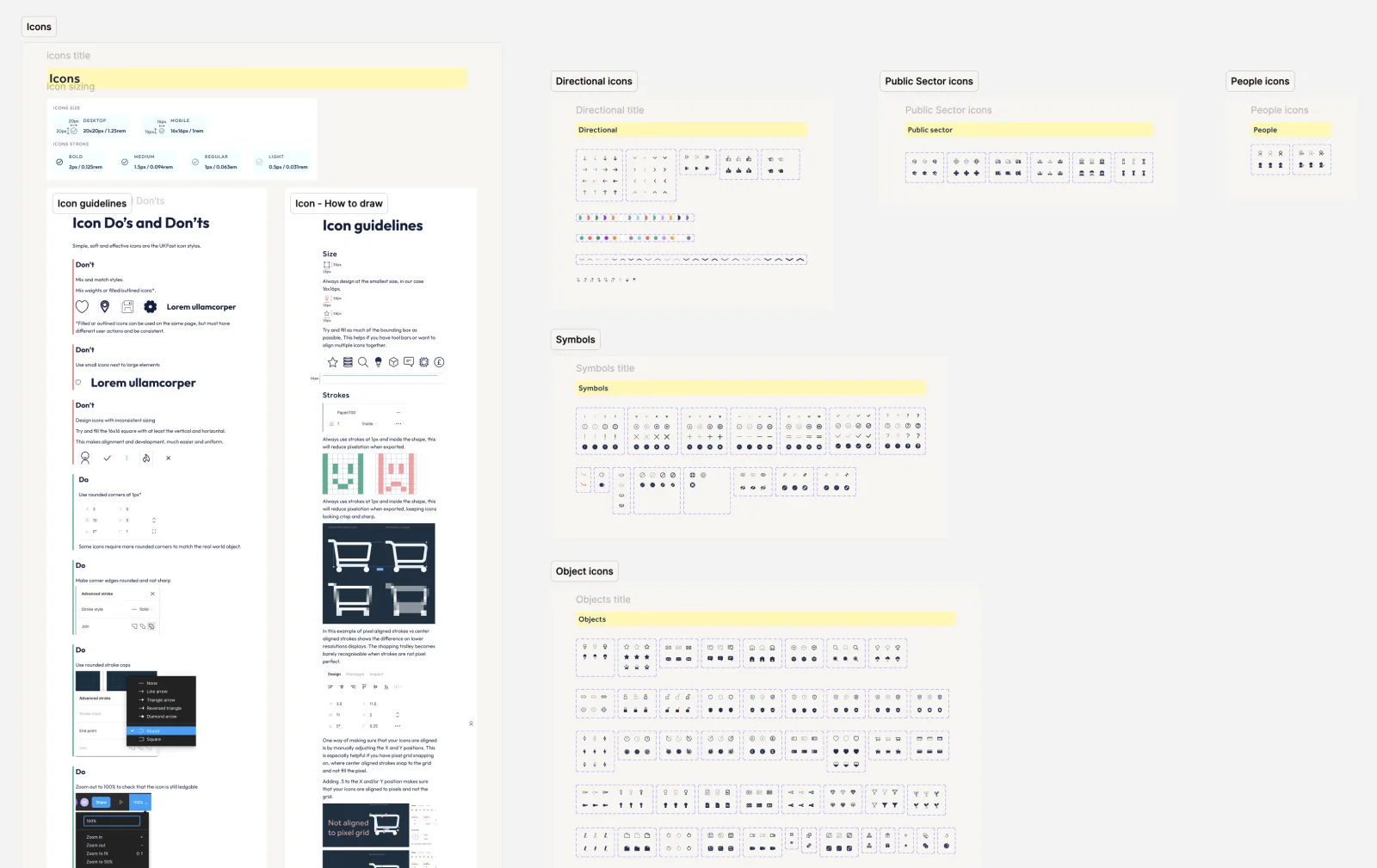
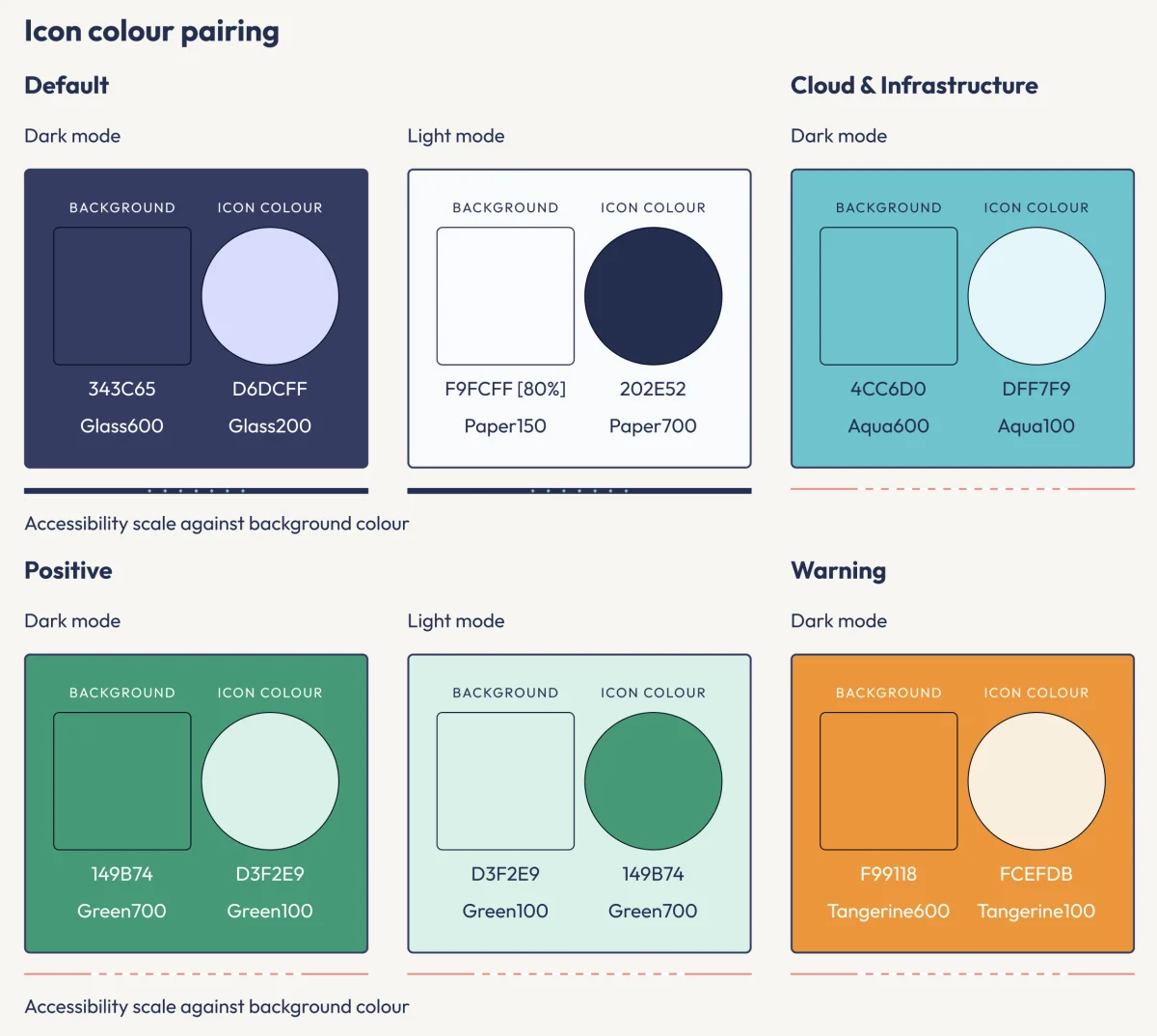
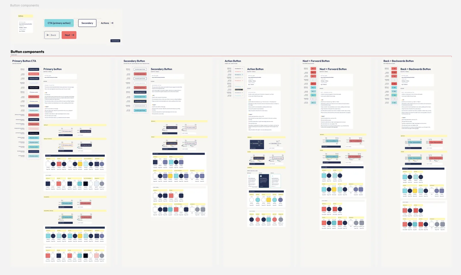
I built the system collaboratively, with the teams who would use it: 1,000+ components, 900+ custom icons and 300+ illustrations. With teams on different stacks, a shared design language gave everyone the same parts and the same rules to build from, whatever their codebase.
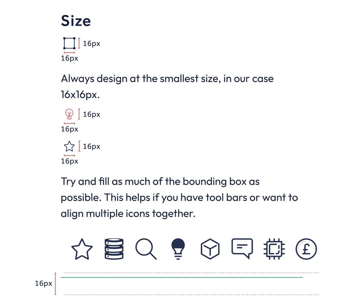
Training and education were paramount. I ran workshops, paired with designers and developers on real work, and wrote the teaching into the design system itself: every part came with how to use it, why, and the do's and don'ts, down to how to draw an icon on the pixel grid.
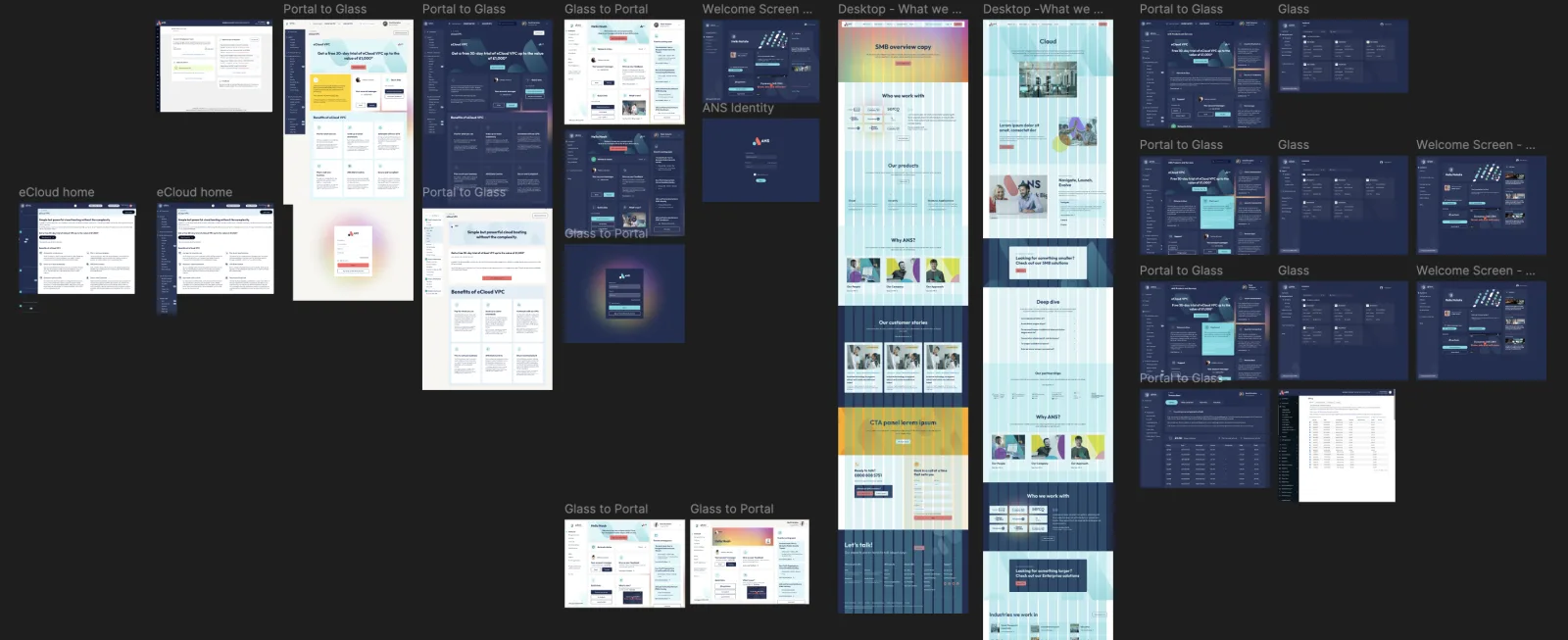
During the merger, UKFast's and ANS's customer portals were combined into one new portal, Glass. We called the work Portal to Glass.
Alongside it, I made user research a standard step, so teams tested ideas before building them. And I created a roadmap framework linked to Jira and Azure DevOps, so product, engineering, sales and marketing could all see what was being built, why and when.
What changed
The system was adopted across the business and now supports more than 100 products. Teams stopped duplicating interface work, products became more consistent, and research reduced the risk of building the wrong thing.
Highlights
- Built a design system adopted across the business: 1,000+ components, 900+ custom icons and 300+ illustrations
- Made user research a standard step, so teams tested ideas before building them
- Created a roadmap framework linked to Jira and Azure DevOps, so every department could see what was being built and why
- Introduced a pricing strategy that stopped the business competing on price alone