ANS Group · Managed Detection and Response
Making cyber threats easier to understand. And act on.
How we helped ANS replace an ageing cybersecurity product with a clearer, more accessible Managed Detection and Response experience.
- Product
- Managed Detection and Response (MDR), powered by VMware Carbon Black.
- My involvement
- UX and product design leadership, working with a multidisciplinary team.
- Delivery
- Five sprints.
- Case study by
- Paul Wilshaw, with the project's UX researcher and product owner.
The challenge
Cybersecurity is complicated enough. The software helping protect your business shouldn't make it harder.
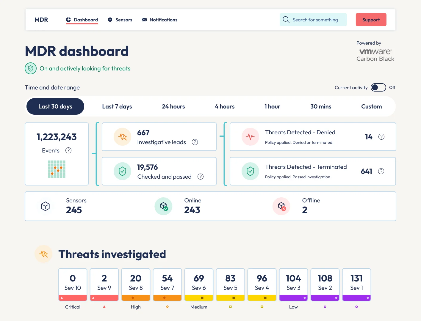
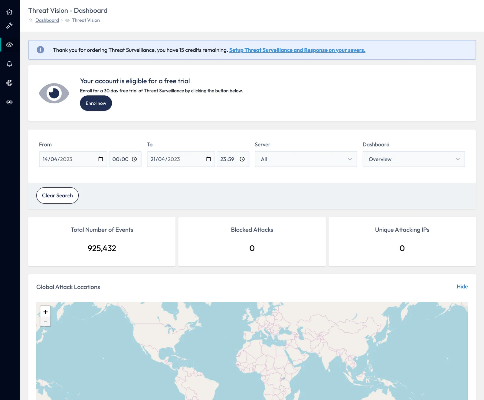
ANS had an established threat-monitoring product called ThreatVision. But maintaining it was becoming increasingly difficult.
The underlying architecture needed work. It relied on Python expertise the team no longer had, documentation was limited and automated testing wasn't where it needed to be.
More importantly, the product wasn't providing enough value to customers.
We needed to stop investing in maintaining the old experience and start designing something genuinely useful.
The commercial direction was to use Carbon Black for the underlying security capabilities, allowing ANS to concentrate on the value of its Security Operations Centre (SOC) and managed service.
Our challenge was to turn that technical capability into something customers could understand, navigate and trust.
Start with the people, not the dashboard
Before designing interfaces, we needed to understand who would use the product, what mattered to them and how much cybersecurity knowledge we could reasonably expect.
We developed personas, considered different product packages and mapped scenarios around real customer goals.
We also reviewed competing services, including Sophos, CrowdStrike, Trend Micro and NCC Group. This helped us understand what customers might expect from threat monitoring, alerts, onboarding and incident reporting.
The important question wasn't how much security data we could show. It was what customers needed to know and what they should do next.
Design, test, learn. Then challenge it.
We combined discovery and scenario mapping with rapid prototyping and incremental releases.
The first experience concentrated on essentials:
- Getting customers onboarded.
- Setting up security notifications.
- Understanding monitoring information.
- Exploring threats and severity.
- Filtering information over time.
We developed an initial experience quickly, including a simple landing page and an alpha monitoring dashboard.
Then we tested it.
Five people. Four tasks. A lot of learning.
Five internal users with limited specialist knowledge tested the prototype against four tasks covering onboarding, dashboard exploration, alert management and filtering.
All five completed the assigned tasks successfully.
But task completion wasn't the whole story. The research uncovered important opportunities. Users wanted clearer explanations of severity levels, more flexibility in notification recipients, simpler date filtering and reassurance that the service was actually protecting them.
Some information was technically present but wasn't meaningful. That distinction matters.
A user can complete a task and still leave without understanding the product.
The moment we challenged the design
Before moving into customer beta testing, we discovered something important.
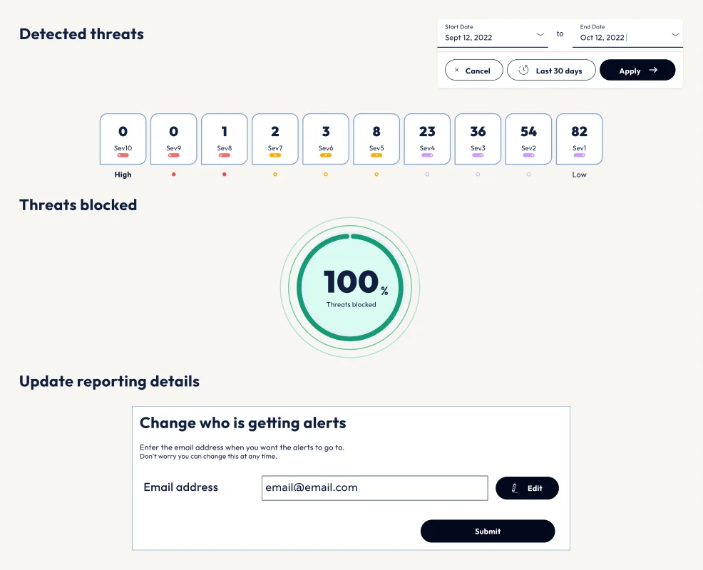
One of our most prominent components, showing threats blocked, wasn't presenting accurate information. Worse, we'd illustrated a relationship between threat severity and blocked threats that the available data didn't actually support.
We could have kept the component because it looked impressive. We didn't.
When the data doesn't support the design, change the design. Don't bend the truth to fit the interface.
We stopped, revisited the available Carbon Black data and returned to the original customer needs. Working with the wider team, we explored a more transparent way to communicate what the service was doing.
That decision reshaped the experience.
Turning security data into something meaningful
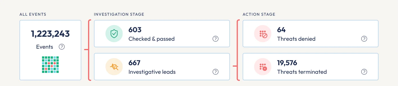
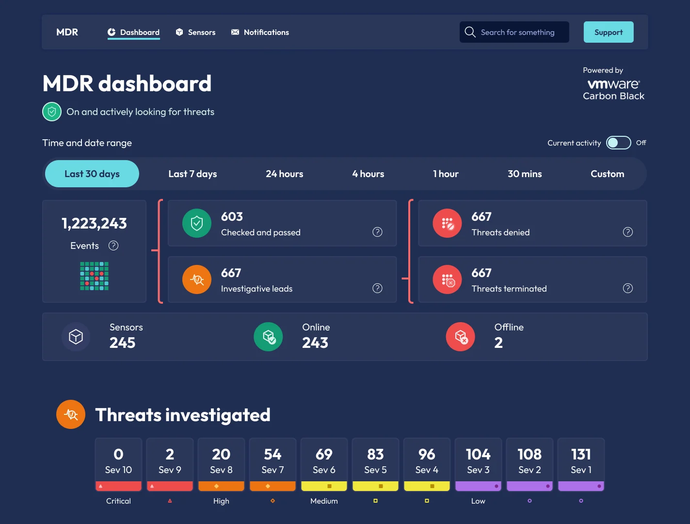
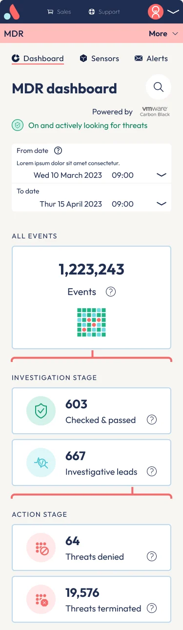
Instead of presenting a collection of disconnected numbers, we introduced a clearer security information hierarchy.
A security funnel that explains the story
We redesigned the dashboard to show how security events move through different stages. The approach connected the available information to the recognised MITRE ATT&CK framework, giving customers a clearer view of what was happening.
It wasn't about displaying more data. It was about helping people understand the relationship between the information in front of them.
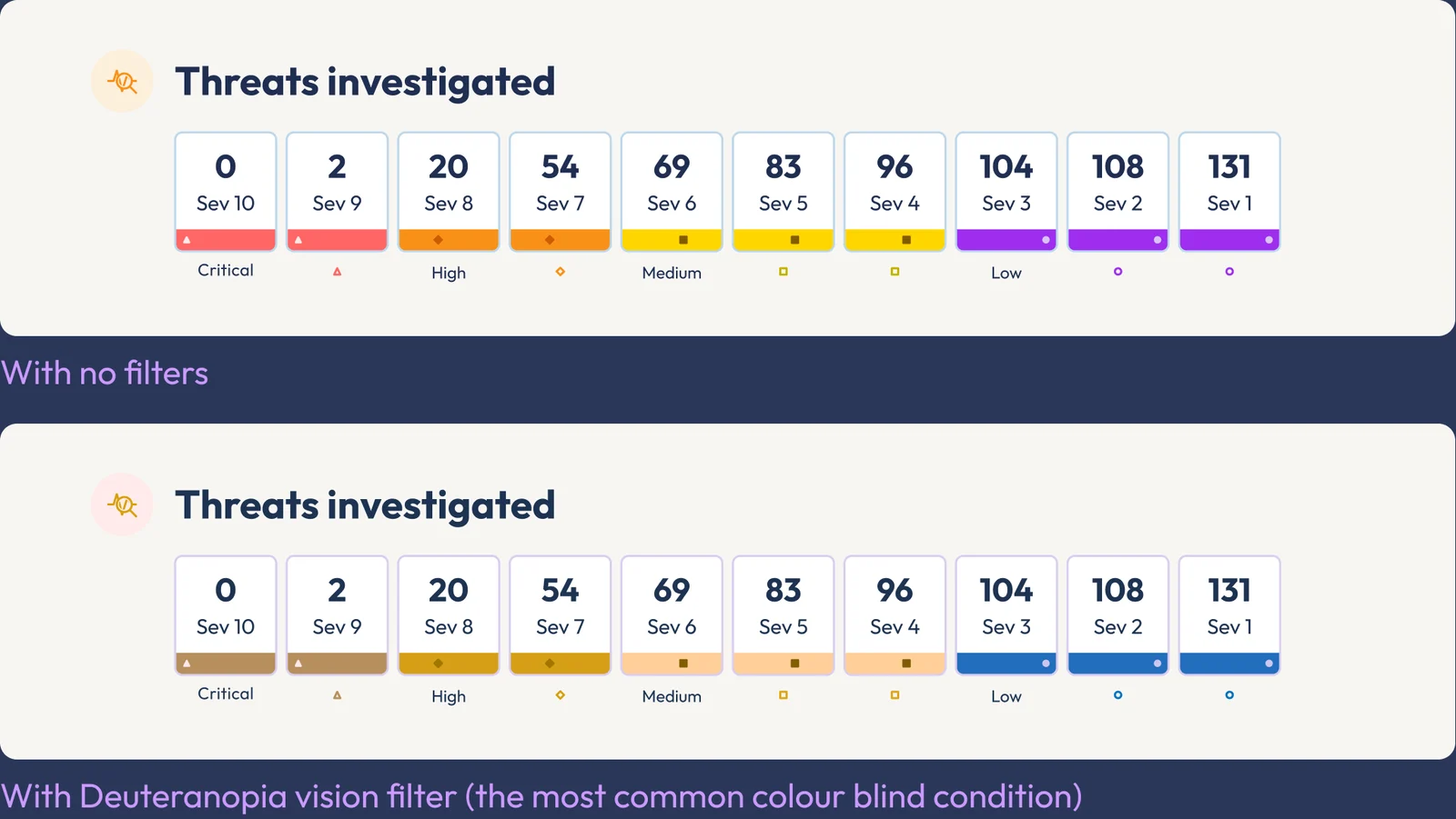
Severity without relying on colour
Security alerts need to be understood quickly, including by people who cannot distinguish certain colours.
We designed severity indicators using labels, shapes and consistent positioning, rather than colour alone. We also considered how the information would be communicated through assistive technology.
Accessibility wasn't something to add after the interface worked. It influenced how the information was structured.
Clear information about what happens next
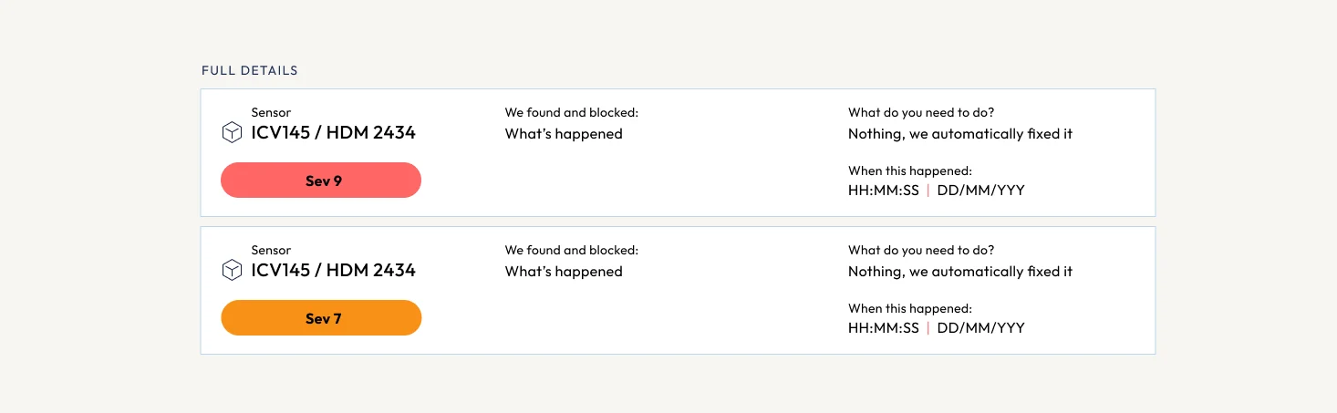
Users wanted to know what action they needed to take when a threat appeared. But this was a managed service. In the initial release, ANS was responsible for responding to threats.
So instead of introducing unnecessary controls, we explained what the service was doing and gave customers clearer information about their protection. The aim was to build confidence without creating unnecessary support enquiries.
Help where you need it
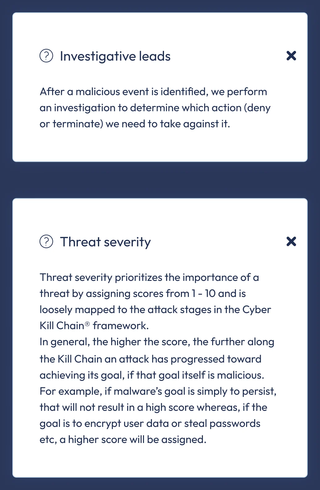
Rather than relying on lengthy onboarding videos or documentation that could quickly become outdated, we introduced contextual explanations.
Customers could find more information when they needed it, without leaving the dashboard. That meant supporting both experienced customers and people less familiar with cybersecurity terminology.
From alpha to a more complete product
Across five sprints, the experience evolved through early releases and feedback.
We refined the monitoring dashboard, introduced clearer severity reporting, improved filtering, strengthened onboarding and supported desktop and mobile experiences. The designs also evolved to accommodate light and dark modes.
As the experience matured, we added tested patterns and reusable components to the ANS Figma design system, creating opportunities for consistent implementation across other products.
This wasn't just about shipping a security dashboard. It was about building a more useful product while strengthening the foundations for future work.
The outcome
The project established a clearer product direction for ANS Managed Detection and Response.
The documented outcomes included:
- A move away from maintaining the ageing ThreatVision experience towards a Carbon Black-powered service.
- Successful completion of all four assigned tasks by five internal alpha testers.
- A redesigned security dashboard informed by research, data availability and technical constraints.
- More transparent communication of security information, replacing a misleading component.
- Accessible severity indicators that did not rely on colour alone.
- Clearer contextual guidance to help customers understand their protection.
- Reusable patterns and components added to the wider ANS design system.
- Desktop and mobile experiences, including light and dark themes.
We didn't measure a reduction in support calls, development costs or security incidents, so this case study doesn't claim one.
What this project taught me
The most important design decision wasn't what we added. It was what we removed.
When we discovered the dashboard was presenting misleading information, we had a choice: protect the design we'd already invested in, or return to the problem we were trying to solve. We chose the latter.
That meant challenging assumptions, working with engineering and product specialists, and finding a better way to represent complex information.
For me, that's what good product design looks like. Not just making complicated software easier on the eye.
Making complicated information useful, understandable and trustworthy.