Blue Prism · January 2019 – May 2021 · Head of UX and UI
Building a UX function from zero
I joined Blue Prism as its first UX designer and grew the design team to 20+ people. Along the way I set the strategy for modernising an automation platform first released in 2003, without stalling the products enterprise customers relied on.
Blue Prism · Head of UX and UI
The situation
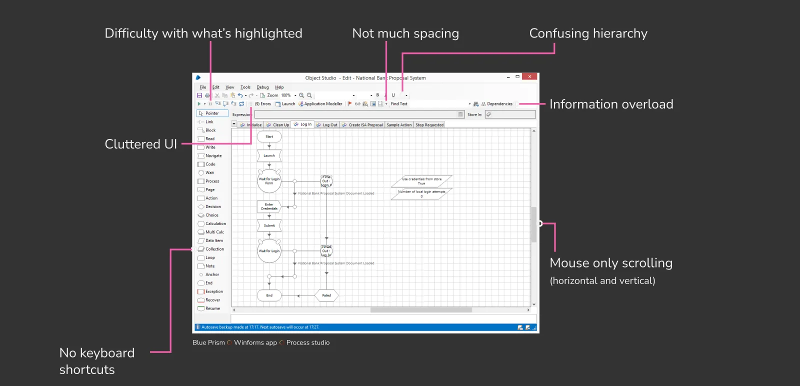
Blue Prism's automation platform ran on a Windows desktop app first released in 2003. New cloud apps were being built in React, and acquisitions had brought in products with their own brands. Customers were global enterprises that often took years to upgrade.
One user summed up the existing experience as "scary, confusing and ugly".
The decision
The obvious answer was a full redesign. But the desktop app had no development resource for a visual overhaul, and redesigning part of it would leave customers with a patchwork of old and new. Designing screens on request for six sprint teams wasn't sustainable either.
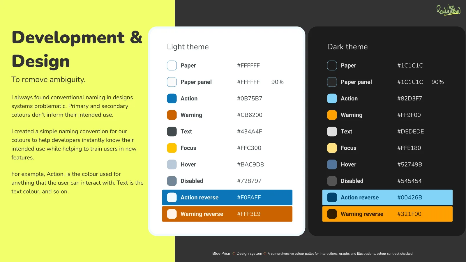
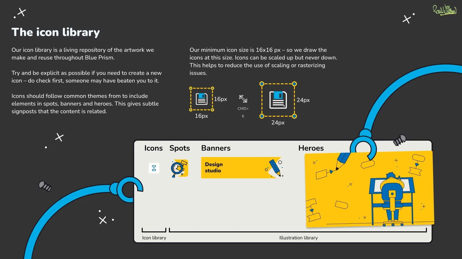
I recommended two design systems with shared foundations. One brought consistency and accessibility to the desktop app within what it could support. The other set the standard for the new web apps. Shared colour, iconography and illustration made both feel like one product family, so customers on old and new versions weren't stranded.
What I built
- The team. Grew from zero to 20+ across UX, interaction, UI and illustration, research and UX engineering. See Building the team, below
- Ways of working. Design mobs with developers, and Framer prototypes to test ideas and get engineering buy-in before building. The team moved from Sketch to Figma
- Design to code. A pipeline that pulled colour styles from Figma through its API into light and dark themes, so engineering used the same values as design
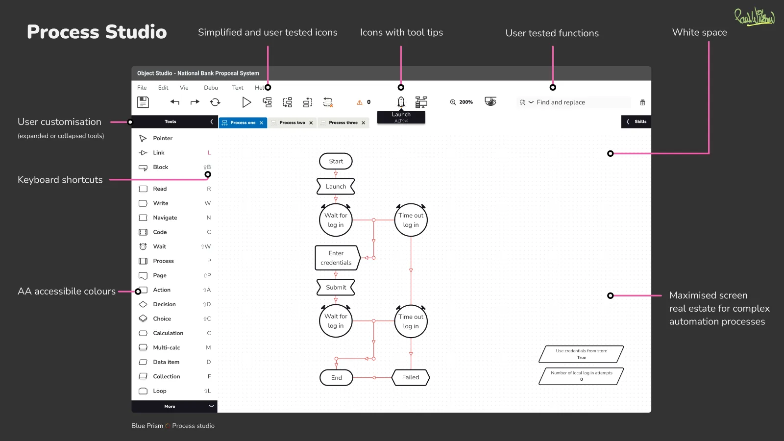
- Accessibility by default. An AA-checked colour palette, plus keyboard access and clearer hierarchy in Process Studio, which previously required a mouse
- Shared libraries. Icon and illustration libraries reused across products, the website and internal materials
- Research. Function-based personas and a feedback culture across product teams
Building the team
I grew the team over 24 months, timed to the V7 roadmap. V7, the cloud version, had been scoped as a seven-year programme for a smaller team. To bring it to market sooner while carrying over more than 15 years of features, the team had to grow, so hiring was phased as demand for V7 grew. I managed the whole team, with senior designers mentoring the more junior roles.
- Lead UX designer. Supported the existing desktop software in its current form, so customers weren't left waiting while work on V7 began
- Three UX engineers, hired through Northcoders. Blue Prism's development team was backend-heavy. Bringing in new talent added front-end and visual capacity, and developed new people rather than competing for scarce senior hires
- UX researcher. Hired as demand for V7 grew. The lead and I had been doing research ourselves; a dedicated researcher grew the function and gave us time back
- Mid-level and senior designers. Mid-level designers were embedded in sprint teams, working Lean UX style with just-in-time designs. Seniors took on day-to-day mentoring
- A principal designer in London, working on AI and other experimental projects
I also rewrote the recruitment process and job descriptions to reach a more diverse talent pool, and added accessibility training to company-wide onboarding, so accessibility became part of everyone's job.
Research over requests
The early plan for V7 was to rebuild everything the desktop app did, in the cloud. Feature requests came mostly through sales, from the people who buy automation software rather than the people who use it every day. Both views mattered, but they described different products.
Research gave us the users' side: what they actually relied on, and the workarounds they'd built where the product fell short. One came up again and again: teams exported data into spreadsheets to build their own reports for leadership on what the robots were achieving. I shared what we found with sales and product leadership alongside the buyers' requests, so we could decide together what V7 needed to do first.
Research changed the plan. The assumption had been to rebuild the core product as a web version, which would have asked existing customers to rework their automations and start again. Research led to a different decision: deliver a new product that worked alongside what customers already had.
That product was Decipher IDP, an early AI product. A custom neural network read documents, from scanned paper to digital text, and fed the data into customers' existing automation workflows. It could be sold to existing customers as an addition, not a forced migration.
What I'd do differently
Decipher was the right direction, but it was slow and costly to build. It proved the need for cloud software, but it's now a free add-on, so its commercial impact was limited.
With hindsight, I'd have shipped something low-stakes and high-value first. The spreadsheet workaround pointed to an easier win: shareable dashboards that kept senior leaders and purchase decision-makers updated on the software's performance and the productivity it delivered. Fully cloud-based and quick to build, they would have proved the software's value and the usefulness of cloud at the same time.