Design system across four brands · Design direction, design systems and AI-assisted experimentation
Four brands. One design system. Experiments built in hours.
A bespoke design system delivered in three months. Experiment builds reduced from weeks to hours.
Every new design and build was starting from scratch. Across four brands, that meant slow delivery, inconsistent experiences and very little an AI tool could reliably build from.
I created a shared design system in three months, then helped the team use it to design, build and test ideas faster.
Consistency with character
The experience needed to feel premium, tactile and distinctive, so consistency couldn't mean making everything look the same. I brought brand, UX and engineering decisions together, and balanced creative ambition with what the team could realistically deliver.
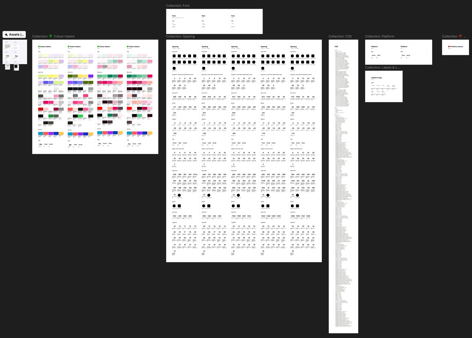
Tokens and reusable components gave all four brands the same starting point. The team stopped designing and coding the same elements over and over, and developers had clear references to build against instead of another round of discussion.
Design once, adapt everywhere
The products ran on mobile apps, mobile web and desktop. Designing every screen three times, then updating all three whenever something changed, wasn't going to scale.
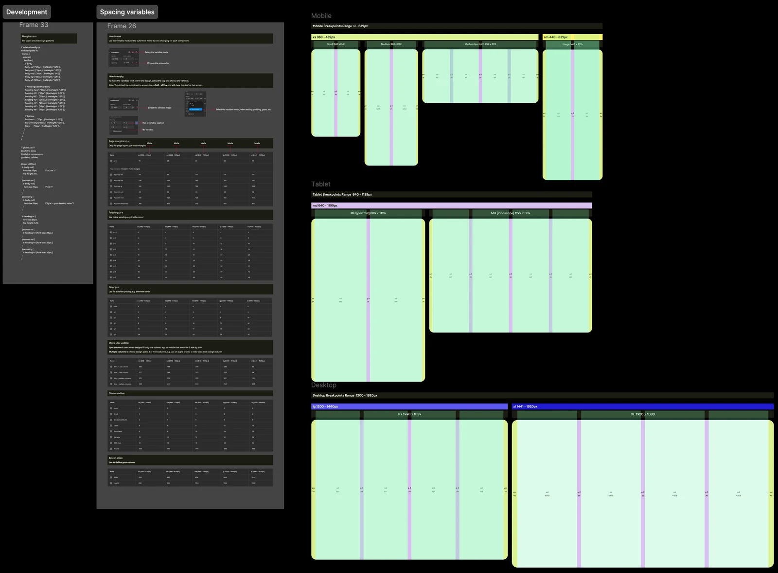
So we started with mobile and used Figma variable modes to build the adapting into the components themselves. Instead of a separate design for every breakpoint, applying the relevant variable mode adapts the component's layout and spacing.
Take an offer card. It looks simple, but it has to work in a compact mobile list, a larger content grid and on a desktop page. With variable modes it stays one component with one structure, and adapts to each. That meant far fewer designs to keep up to date, and a clearer picture for engineering of how each component should behave.
The goal wasn't to produce more designs, faster. It was to need fewer designs in the first place.
More than a Figma library
A library that looks good in Figma but never reaches production isn't much use to anyone. I coached developers, supplied code and examples, and contributed to Storybook so the system became part of everyday delivery. Before long it was supporting:
- Everyday engineering: the patterns behind routine development and maintenance
- Experiments: a consistent starting point for testing new ideas quickly
- A custom Chrome plugin: taking the system into the tools we were building
- Product teams: one design language across different platforms
How an experiment gets built
- Hypothesis. Each experiment starts as an Azure DevOps ticket stating the hypothesis and the metric that decides it.
- Context. The AI reads the ticket and pulls in the design system through the Figma MCP. It also draws on skills and reference files covering accessibility, our design standards and modern web standards, plus data from our data platform.
- Build. The AI builds the experiment variant from the design system's foundations.
- Check. I review every variant through manual QA and my own UX UAT skill, which tests it against the design system and standards.
- Release. Variants go through dev, QA and production like any other change. Nothing reaches customers outside the normal pipeline.
- Measure. Results are read against the metric set in the ticket.
Built for humans, ready for AI
The same structure made the system useful to AI. I didn't want AI generating more interfaces. I wanted it generating ones that belonged to the product.
That meant treating the design system as a set of rules and building blocks, not just a visual reference. Experiments were designed in Figma with the established tokens, then built and checked against the design through an AI-assisted workflow.
People still made the calls that mattered: which problem to solve, which idea was worth testing and how the experience should feel. The UX team reviewed usability, accessibility and brand before anything launched. Humans set the standards, AI sped up the build, and the experience stayed consistent.
From weeks to hours
Once the system and workflow were in place, working A/B and multivariate variants took hours to build instead of weeks. That left more time to explore ideas, refine the experience and get changes in front of customers, though measuring their impact still needed a full experiment.
A later hero redesign shows what became possible. I designed and built an interactive banner and a bespoke CMS module in less than a day, then reviewed the pull request with engineering and merged it to production.
The business impact
Following launch, annual revenue across the products rose by 10%. The team also gained a faster way to improve all four brands, with far less duplicated design and development work.
With the familiar decisions already made, there was more room for the creative ones: what to change, what might surprise people and what would make the experience worth choosing.